Overview
500px is an online photography community that provides a simplified experience for users to connect and share their work. With a community of over 15 million users and over 100 million submissions, it’s become increasingly difficult to discover content from undiscovered photographers. Majority of users feel frustrated by the inability to gain recognition and appreciation.
Tasked with this problem, Design partnered with Product, Marketing & Engineering together we identified opportunities and strategized how to validate the hypothesis that by improving the recommendation algorithm we would provide users better opportunities to gain recognition.
500px is an online photography community that provides a simplified experience for users to connect and share their work. With a community of over 15 million users and over 100 million submissions, it’s become increasingly difficult to discover content from smaller photographers. Majority of users feel frustrated by the inability to gain recognition and appreciation.
Tasked with this project, Design partnered with Product, Marketing & Engineering, together we identified opportunities and strategized how to validate the hypothesis that by improving the recommendation algorithm we would provide users better opportunities to gain recognition.
Diagnosing the problem
"A photographer on 500px should be able to receive appropriate exposure & recognition for their work within 24 hours of upload."
"A photographer on 500px should be able to receive appropriate exposure & recognition for their work within 24 hours of upload."
Initial research into user perception of recognition yielded that affections, better known as likes, are the most tangible form of feedback, having positive correlations with both self-esteem (how a person feels about themselves) and self-confidence (how a person feels about their abilities to perform). The two are very closely related i.e., a user who obtains recognition or likes gains more self-esteem which gives them confidence in their craft.
The project began by determining which area of the product had the highest correlation to likes, the data revealed that majority were being distributed through the Homefeed. This is a self-curated experience that allows you to discover new content from those you follow and a form of recommended photos. We decided to tackle the problem here as It was predicted it would prove to show the highest return on investment.
How we measured our success
Everyone should receive equal opportunity to gain exposure and receive appropriate feedback. The majority of likes are given to a small percentage of popular users who have very large followings. To hold ourselves accountable we determined the metric of success was flattening the distribution of likes given within Homefeed.
The MVP before the MVP.
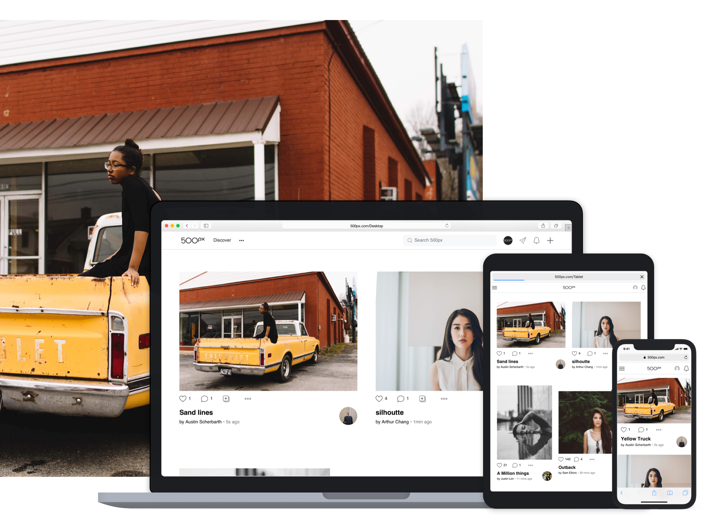
The most drastic change to the Homefeed happened on web. We aimed to create a more dynamic layout which utilizes the space of larger monitors. The concept displays 2 photos per row which aimed to enhance discoverability of photos from those you follow. Content is king, the assumption was as a user scrolls their eyes will naturally be drawn towards the image that appeals most and all secondary info is still present to aid their consumption.
The mobile clients followed in suit with the web design but mainly a reskin, the photos are still displayed one at a time (excluding recommendations v2).
Evolution of the Homefeed on Web, from one column to a dynamic layout that shows more photos per row.
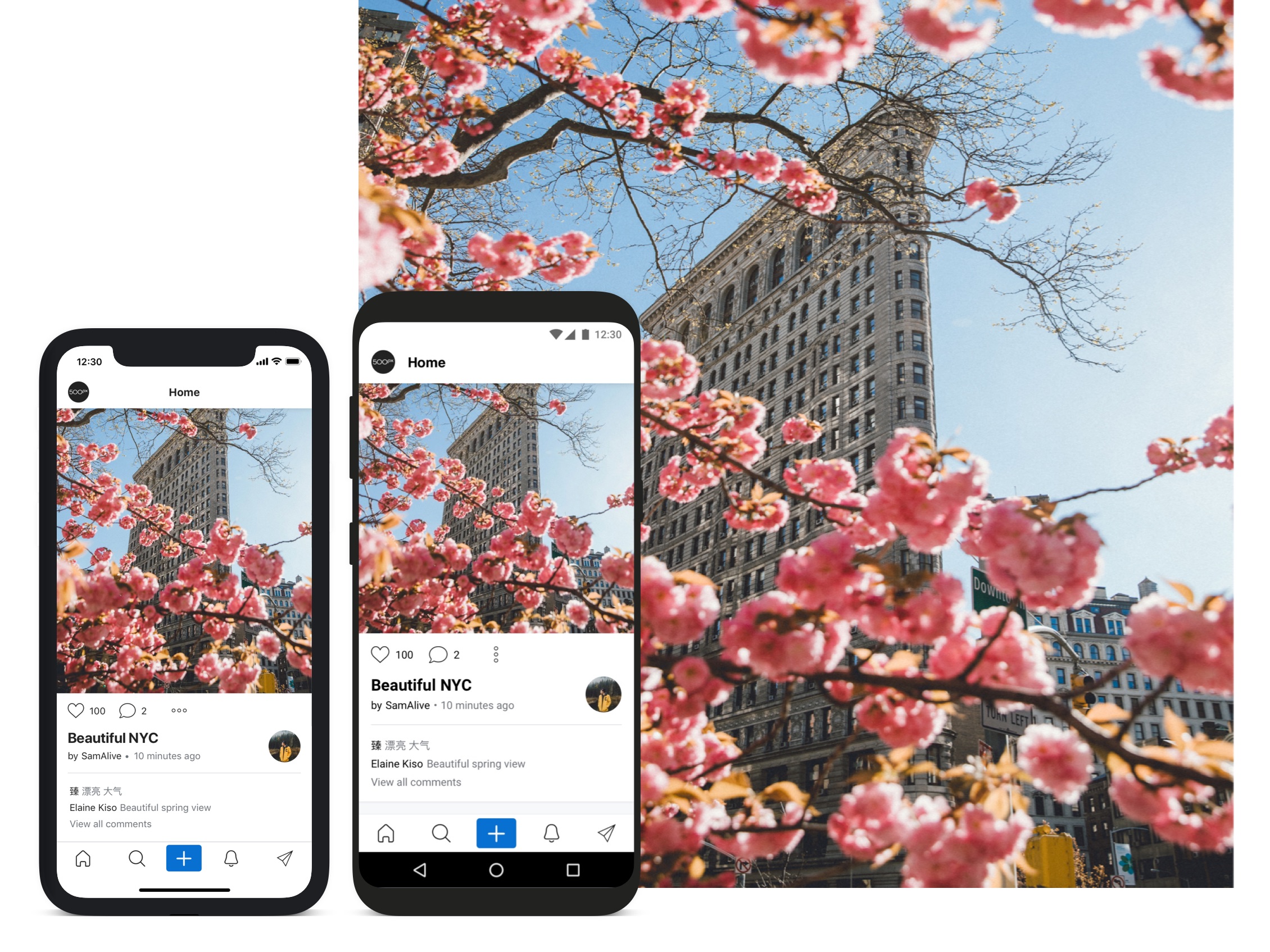
New Homefeed Mobile designs for IOS & Android.
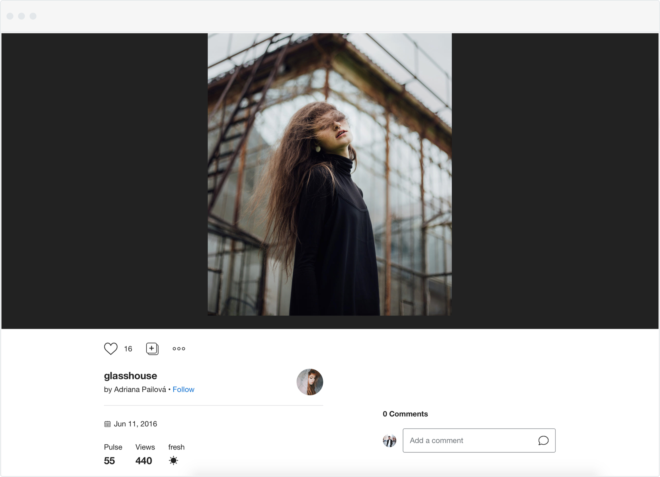
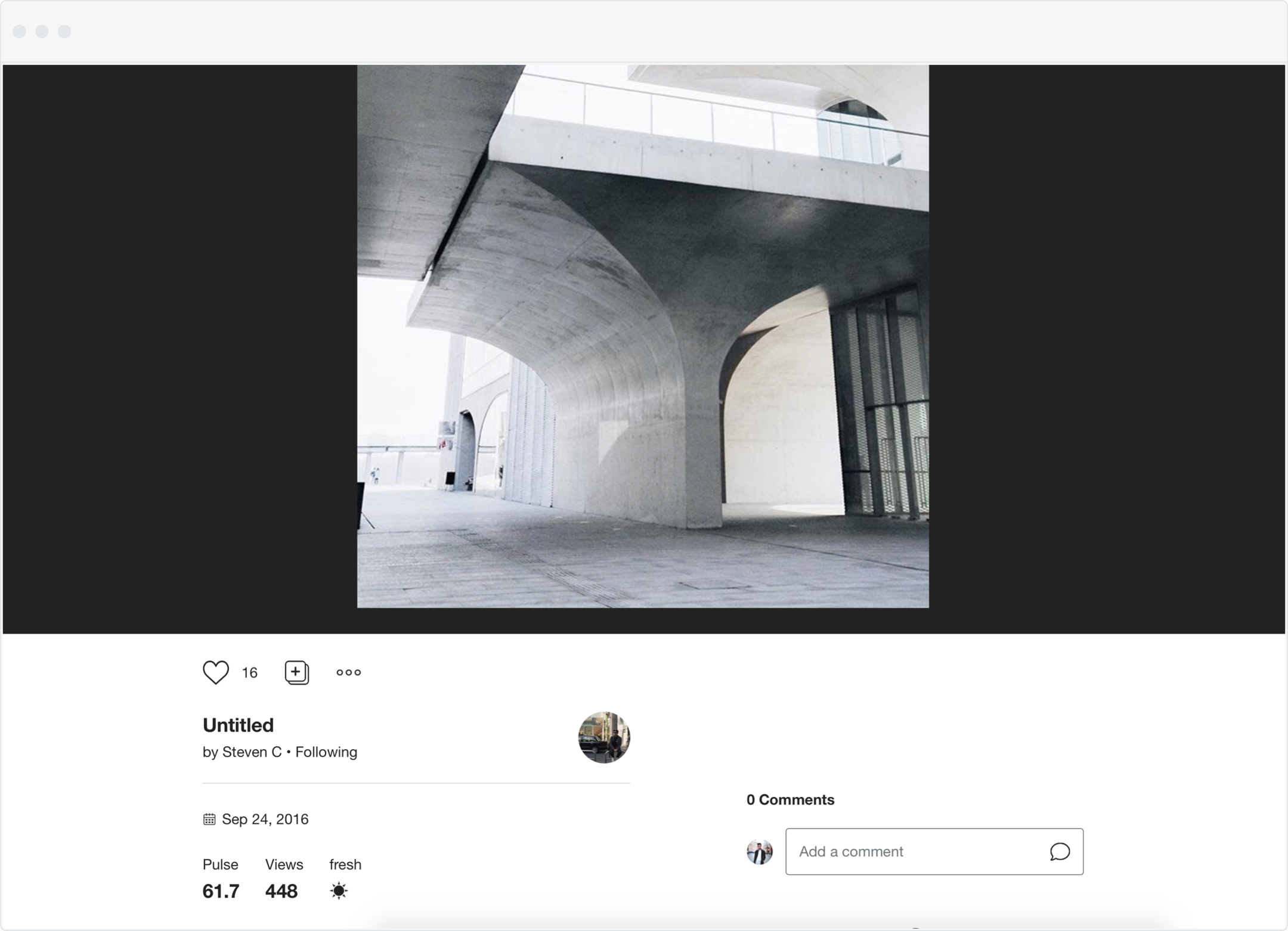
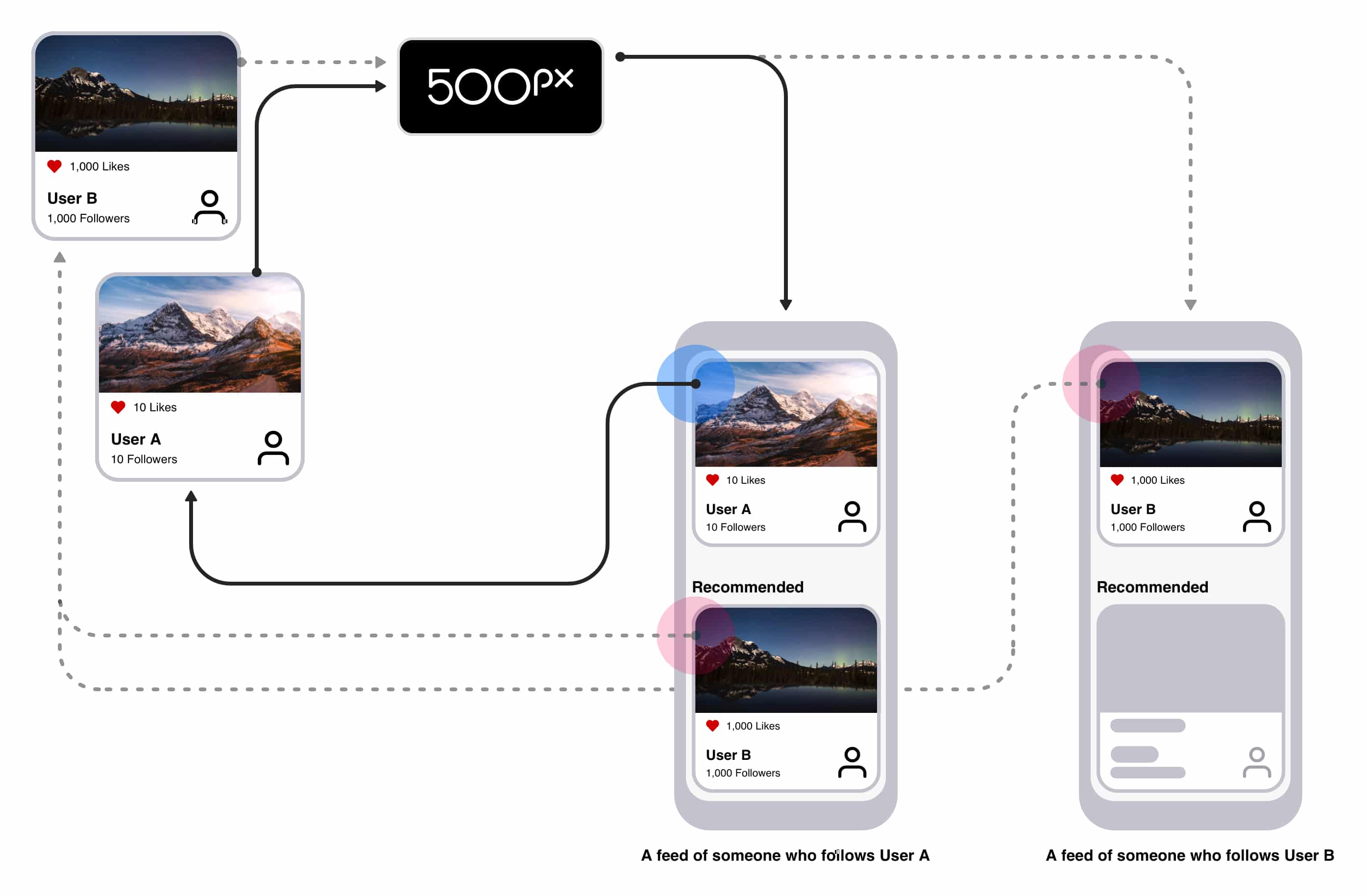
The existing recommendations very low level and purely based on social behaviour, the algorithm filters and displays any photo with over 1000 likes. The system was revised to incorporate a content based system, utilizing various control parameters to choose and serve more personalized photos. The design packages and displays the new integration as a set of 12, a carousel on mobile, and a grid on desktop.
The existing recommendations very low level and purely based on social behaviour, the algorithm filters and displays any photo with over 1000 likes. The system was revised to incorporate a content based system, utilizing various control parameters to choose and serve more personalized photos. The design packages and displays the new integration as a set of 12, a carousel on mobile, and a grid on desktop.
Web and Mobile versions of Recommendation integrations in the Homefeed.
Testing the concept
Testing the concept
Hi-fidelity prototypes were created in-order to generate a more realistic reaction. A cohort of 5 existing users were recruited from our user base and local photography groups.
The prototypes were specifically tailored for each participant, pre-populating the feeds with photos from those they follow and serving recommendations based on the proposed algorithm.
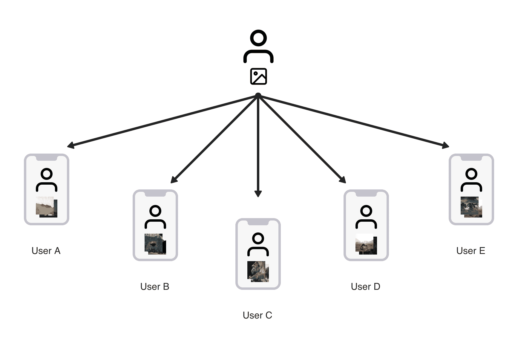
Prototypes were personalized for each participant to create a sense of realism.
Feedback
1. Majority of Participants described themselves as more engaged due to the cleaner design and labelled information as organized in a way that was easier to parse.
2. Majority of participants reacted positively to 98% of the recommendations and responded they discovered new photographers they haven’t seen before on 500px.
3. Recommendation design on mobile was described as hard to differentiate, often missed during first round of scrolling due to the extreme similarity in design with other cards. Participants noticed them during their second time using the prototype.
4. Recommendation grid on web feedback described them hard to differentiate photos from those you follow if the heading for context was scrolled past.
Based on our testing we updated the recommendations, on Web the grid changed to a carousel to be less intrusive and on mobile the carousels were updated to have more visual discrepancy to create contrast from the other cards.

Modified carousels on mobile to be more differentiable and convert grid on web to a carousel to be less intrusive.
Beta feedback
The implementation of the recommendations was not quite at the level anticipated. In retrospective during testing participants should have been given an even split of good and bad photos to generate a better distribution in responses. Majority of feedback was based on this problem, recommendations being extremely low quality and not relevant to the user.
Further iterations were made, looked to incorporate Google Nima (Neural Image Recognition Algorithm) which improved the algorithm significantly.
Shipping the product
For the product to be successfully put into the hands of users, email blasts were sent out and a public post was made on the newsroom, both were done to inform users of new changes. The goal and intentions of the redesign were summarized and we encouraged users to login to view all the updates.
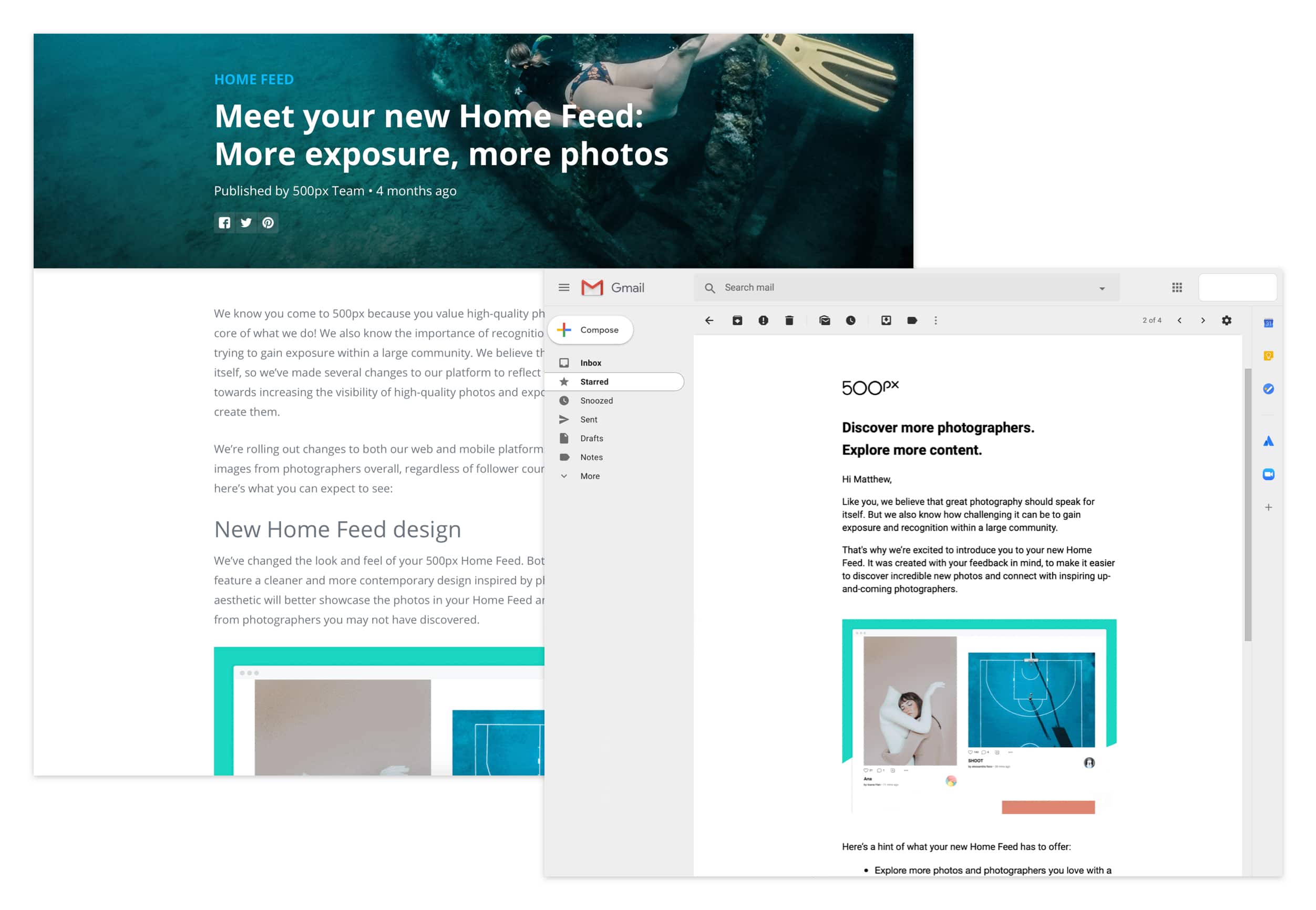
Public news post and Email inform our users about the changes.
The product launch was faced with negative press from big news sites such as Techcrunch & Petapixel due to a small group of users filling up the comment section speaking against the new design changes and recommendations.
Wins for the consumer product means wins for 500px
In light of the noise within a few months of examining the new Homefeed service the data informed us there was a relative percent redistribution of likes. Smaller photographers began to appear more frequent on the platform and concluded the interim target was met allowing the team to scale this product further.
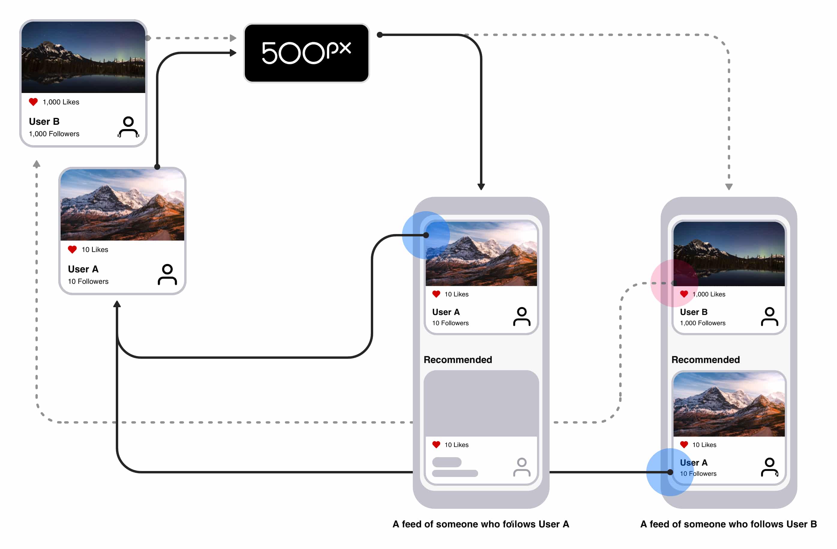
New recommendation display recommendations based on preferences giving User A an equal opportunity for more exposure if photo quality matches up with a user's preference.
Seeing small success fueled the teams hunger to learn and iterate. The process was not perfect but served as a valuable learning experience for the team on projects moving forward.
